Pages

Thursday 31 December 2015

Nettle green


Last project of 2015!  I've just finished a pair of bed socks knitted in super-soft angora and merino wool.  The wool comes from Sarah at BigWigs - she has her own farm with around 80 bunnies in the Yorkshire Dales.  The rather large furry critters get groomed and clipped every few weeks and the fibre is spun with merino wool to make the fabulous yarn.  It's dyed in lovely, earthy shades and this is nettle.  

Happy New Year!

Thursday 24 December 2015

Happy Christmas!


Silver lights and dark green fir tree - Wishing you a happy Christmas and a peaceful New Year!

Friday 18 December 2015

Black, grey, silver


Black, grey and silver - not a reference to the weather although it's a pretty good description of life in the Pennines!  The title is the subject of the Christmas competition for Skioton Embroiderers' guild. 

Combining my recent studies of sampling techniques and concertina books, I made a fabric book using black linen and embellished it with circles of stitches. Each page was folded and joined together with a close zig-zag stitch using variegated viscose thread.  The book is closed with a vintage button and satin ribbon.

Wednesday 2 December 2015

Advent red


This gorgeous red Christmas garland was inspired by a necklace bought on my summer holiday to Turkey.  It's a quick and simple make using crystal organza and beads, linked together with a crochet chain of red cotton. I'll be making lots of these with my sewing friends next week at our annual Christmas crafts day.

Monday 16 November 2015

Black


Black is a colour that divides opinion, like Marmite, you either love it or loathe it.  I'm in the latter camp.  I rarely buy or wear black.  However whilst rooting through my stash for some interesting fabrics for my Contemporary Stitch course I came across a piece of black linen.  Using a bright citrus green thread, I tried some doodle stitching and I was converted!  The flat black colour allows the top stitching to shine out and each stitch is clearly visible.  It make a great foil for other colours.

Although it will never be a big part of my life, I am starting to see lots of possibilities for my new friend black.

Friday 30 October 2015

The absence of colour


All this year I have been exploring colour, the moods and emotions that are evoked by certain colours and my response to them.  But have you ever thought about the absence of colour? 

I was amazed to learn this week that the riot of colour we are enjoying this Autumn is actually caused by the absence of chlorophyll (the green colour in leaves).  So the lovely pinks and reds in my picture were always present in this little tree but were completely swamped by green.  They only become apparent when the tree moves into its dormant winter state and stops producing chlorophyll. Amazing!

Thank you BBC4 The Great British Year, I have changed my view of colour.

Tuesday 13 October 2015

Study in blue


This simple embroidery is a lovely way of using up odd bits of knitting wool and fancy yarns.  I have kept it to just two different stitches, straight and French knots, but by varying the length of stitch and the width of the yarn the effects are quite dramatic.  It's worked on hessian which has the advantage of being a very open weave: the warp and weft move to accommodate huge slubs but then close around finer threads.

It's very therapeutic - not only because it used up so many bits but it doesn't require much thought or planning. I did it as a demonstration piece at Yarndale 2015 and most of it was completed whilst standing up, talking to visitors. 

Monday 28 September 2015

Fields of green


It's been a weekend of sheep and other woolly critters this weekend at the fabulous Yarndale event in Skipton. 

I made this little picture for Skipton Embroiderers' Guild stand where they created a continuous wall depicting lots of sheep and fields of green. We were hoping to inspire people to take up stitching again by showing the diversity of styles and skills of guild members.

Mine is a bit of a cheat with a piece of map copied onto calico and layers of sheer fabrics to make the sky and hills. I still couldn't capture the view as I left the show on Saturday evening with the sun setting over the hills. Magical!

Tuesday 22 September 2015

Pearly white


A simple collection of vintage mother-of-pearl buttons stitched onto linen. Made in celebration of my wedding anniversary, 21st September.

Each button has it's own unique colour and lustre.  I bought most of them from the lovely ladies who trade as Lolly and Win but I didn't have quite enough so I added a few little gems from my inheritance (Gradma's button tin). 

Sunday 6 September 2015

Small colour, big impact


The lovely Pennine hills turn purple in August (and September since we're a little late this year). It's all thanks to the tiny little flowers of the moorland heather. The effect is stunning! 

The landscape transforms from a bleak no-mans-land into a carpet of bouncy purple shrubs.  The best time to see it is in the late evening sunshine when the hills appear to glow - it makes my heart sing!

Sunday 16 August 2015

Turkish Blue


I'm just looking back over my holiday photos and remembering the brilliant blues I found in Turkey.  Bee boxes stacked on the side of the road, crystal clear water, nazar eye beads to ward off evil and blue tiled mosques.  Happy memories.

Monday 3 August 2015

Purple Basil


This morning's foray to the local market yielded a huge bunch of purple basil.  Large serrated leaves that are almost black in colour, flecked with splashes of green. I made it into a salad with tomatoes, dates, olives and a sharp flavoured soft cheese, drizzled with local olive oil.  Perfection!

Wednesday 29 July 2015

Red banana


I'm on holiday and enjoying not only a change in weather but also colours. Everything is so bright

I'm watching a banana grow, almost by the hour. Each day a purple leaf unfurls from the flower to reveal another hand of emergent bananas. These leaves are discarded daily by the plant and as they dry in the sun, the skin wrinkles, taking on a leathery appearance.  I have recorded my red banana leaf as a monochrome series of dots and dashes. A kind of banana bar code if you will. 

Pea green (or lilac or mauve or pink or cerise)


The beauty of sweet peas!  The delicate, paper-like flowers.  Their heavenly scent. A seasonal and sadly, short-lived joy.

I'm afraid I'm unable to grow sweet peas in my wind-blown garden but this bunch of loveliness was given to me by my friend Charlotte.  What treasure!

Wednesday 15 July 2015

Red not white


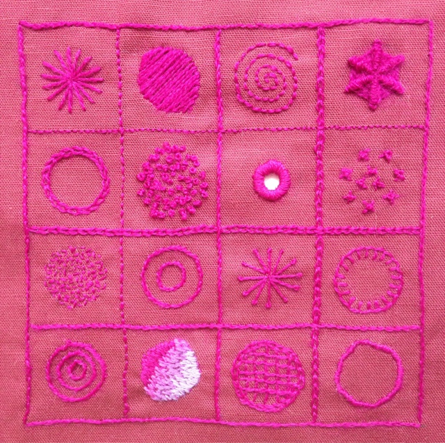
A few weeks ago I met up with a group of sewing friends to try some contemporary crewel work, inspired by Katherine Shaughnessy's book, The New Crewel.  The book is full of beautiful designs which are based on small squares and so they're easy to complete in an afternoon.  I also like the boldness of working with wool threads, they'd quite forgiving!

I tried my hand at a sampler block.  The original idea was inspired by whitework and should have been worked on white or ecru linen with white threads.  I kept the monchrome theme but chose to work on a piece of claret coloured linen using deep pink wool to pick out the patterns.  Like all samplers, this was a learning exercise and there were several stitches that were new to me.  I especially liked spiderweb stitch and square filling stitch but my satin and soft shading stitches leave a lot to be desired! 

Since we are now at nearing the end of the school year, I think my end of term report would be along the lines of "could try harder".

Sunday 28 June 2015

Herbidacious


Maybe it's the return of the Clangers that has made me think of one of my favourite TV programmes from my childhood or maybe it's the abundance of chives and sage in my garden.  Herbidacious was the magic word that opened the door to the garden that belonged to "The Herbs" - a set of characters ruled over by a very friendly lion called Parsley.  My colours this week are the bright green and rich purples of chive or sage flowers.

I've been given this material by a local company, the Design Mill, to make things for the Manorlands Garden Party.  The annual hospice fundraiser is always one of the high points on my calander.  I help run a stall with a couple of friends and we sell handmade items.  It's a throwback to our days of volunteering in the Day Therapy Unit where we were well know for our creativity, craft activities and cakes.

I've made little zippy bags and embellished them with stitches and buttons, using the printed patterns as a guide.  They seem so bright and fresh - perfect for a few pieces of make-up.  

The Manorlands Garden Party takes place on Sunday 12th July 1:30-4:30pm and just in case you're wondering, the Chives were a bunch of unruly schoolchildren and Sage was an owl.  Herbidacious!

Saturday 20 June 2015

Bleeding hearts


This is my interpretation of a Sweetheart pincushion - they were made by soldiers during the First World War as a token of affection.  They often came in kit form but some were made from scraps and included regimental badges.  Grassington Embroiderers' Guild asked their members to make some of these pincushions for their annual exhibition which takes place this weekend.

I chose to make mine in silk, using a sumptuous deep crimson and a dark red-brown.  Both colours echo the blood-soaked mud of the trenches.  Rather than use glass headed pins to decorate the pincushion, I have hand stitched beads and embellished with shiny viscose threads.  The poem was cunningly printed directly onto PVA stiffened calico using a standard desktop printer.

The exhibition of work takes place at Wharfedale Rugby Club in Threshfield on Friday 19th and Saturday 20th June.

Friday 5 June 2015

Something on my mind


As a busy working mother with three teenage girls I'm always juggling my life and commitments. I use mind maps to plan projects so it seemed only natural to take this kind of map as the subject of my entry for the Embroiderers' Guild Regional Competition. 

Something on my mind captures all the many tasks that crop up during a week and my thoughts as I break them down into manageable jobs. I chose to represent it on a head scarf using viscose georgette fabric and machine embroidery. When the scarf is folded into a triangle, the layers of words appear on top of each other, showing the conflict between different activities.

Head scarves were most popular in the 1950's and 60's and so I created a screen print of a stylised rose reminiscent of this era. They appear to be like eyes, watching or passing judgement on me. For my generation, born in the early 60's we saw our mothers break free of domesticity and join the workforce. We grew up thinking we could have it all but learned that our lives are a constant compromise.

Friday 22 May 2015

Transparent life


Last week I spent three blissful days in Grassington at the Stitching in the Dales course run by the local Embroiderers' Guild.  Our tutor was Kate Stewart and she led us on a painterly journey of stitched landscapes using transparent fabrics.

Our starting point was a background of painted cotton organdie and the main image was built up using fragments of coloured voiles and organza.  They look rather ordinary against an opaque surface but hold them up to the light and the colours sing out.  With clever layering you can build up a depth of field creating a wonderful 3D effect.  The fabric is stiffened with thick plastic sheet to make a mini screen or more sculptural piece like the pot of auricula's below.


Friday 15 May 2015

Hot Pink!


Perhaps not the most popular item of clothing for May but I do live in Yorkshire!  These bed socks have been a long time in the making - I think I started them about 5 years ago and abandoned them when it was too difficult to use the circular needles that I'd bought. Thankfully I have been rescued from this nightmare by the loan of a set of double pointed needles from Fiona at the Stitch Society. The socks were finished in a week!

They are made using Rowan Yarns Kidsilk Haze from their book "Little Luxury Knits".  It uses two different coloured yarns, a hot pink and a softer, more muted pink.  The two colours are knitted together for the main body of the socks but the frills are worked in separate colours.  

My daughter hasn't taken them off since they were finished and describes the experience as 'like walking on clouds'. Lovely!

Monday 11 May 2015

Blue and Yellow


Blue and yellow - a classic spring combo!  I made this chic little box at The Stitch Society, Make and Take workshop last week.  Both top and bottom are made from a square piece of paper, folded and cut to make a box.  I just love the print used on the lid.  The whole thing is begging to be filled with chocolates!

We also learned to make little bags with fan-frilled tops and bows that stayed flat. No more boring present wraps for me.  It was a lovely way to spend a Wednesday evening.  Thank you to Fiona and Shelia for their tuition.  

Wednesday 6 May 2015

Shades of white


My friend Helen has been growing some lushous double tulips in her garden and I loved them so much (and took photos!) that she very kindly gave me some so that I could take as many photos as I liked.  

I watched them open up to the sunshine and I loved their blowsy abandon. The creamy white colour was highlighted with yellow streaks at the centre whilst shadows cast grey tones over the curved petals.   Even when they started to die back they retained an elegantly sculptured curl.  

All I have left is my watercolour painting.....

Friday 24 April 2015

Purple haze


Remember the little fabric books that are given to very young children?  Well I've adapted the idea to make a sample book of stitches for a taster workshop that I'm doing at The Stitch Society pop up shop on Saturday 25th April.

I will be demonstrating how to make my stitched cards but I thought the sampler concept would be a good introduction to being more creative with embroidery - no crinoline ladies in sight!  Made in calico and with some patchwork fabric shapes stuck on with Bondaweb, the pages are an ideal way to try new stitches and experiment with the weight of thread or stitch size.  I have attached a couple of buttons (with extra long shanks) and new pages are added by means of buttonholes - my new sewing machine is a whizz at this!  The book makes a good reference source for future projects.

Thursday 16 April 2015

Now showing.....


I've spent the day delivering my work for exhibition, display and sale.  You can see my collection of Favourite Things collages at the Platform Gallery in Clitheroe and at The Stitch Society pop-up-shop in Haworth.  If you're in Haworth on Saturday 25th April why not drop in to the shop where I'll be doing a taster workshop on my stitched cards.

Monday 13 April 2015

Black and Blue


Last week I found this unexpected treasure in my garden - a blackbird's egg.  It is the most delightful shade of blue, speckled with light brown spots.  The colour combination resonates with me and I find it cropping up in my work all the time.  Here is a sample of dye/print/devore work that I did a couple of years ago.  It's silk/viscose georgette that has been acid dyed with pale blue and then Procion dyed with weak rust colour.  The dyes has been selectively stripped out with devore paste and discharge paste which has left complex layers of colour.

Wednesday 25 March 2015

Double colour


My friends at The Stitch Society* Yorkshire have asked me to do a make and take workshop for them in June.  It has to be something that can be made in around two and a half hours and I wanted something suitably summery. So here it is!  A rosey posey fascinator - perfect for Summer weddings or a day at the races.

I've based the design on my wire flower brooches and I wanted to keep the lightness and translucency of the materials.  I have made these using two-tone crystal organza.  I love the way the colour changes as the fabric moves.  The one in the picture is made from a cerise shot with yellow and green shot with black.  I've added some twists of wire and small beads as a nod to the original design.

Tuesday 17 March 2015

A spot of raspberry


My Mother's Day treat - afternoon tea prepared by my lovely girlies and served on a raspberry-spotted, china tea set handed down to me by my mother. What could be more special than that?  Well maybe the raspberry and almond cake that's sat on it but that's another story!

Sunday 8 March 2015

Red sky at night


I have to confess, I've never had any formal art training so when my local art group enlisted the services of tutor, Jane Austin, to teach a water colour class, I jumped at the chance!  Jane works with a wet-on-wet technique. It's fast, it's bold and Jane likes to work on big pieces of paper so it was already ticking lots of boxes with me.

We worked from a photo of an evening sunset. Your eye is drawn to the brilliant colours in the clouds, but it is the dark formations in the foreground that provide all the drama.  These were achieved by mixing deep blues and alizarine crimson with small amounts of red and yellow.  As the paint dries and the paper soaks up the colours, subtle variations appear which add to the depth and complexity of the subject.

The effect reminded me of my Wall to Wall series of hangings: the hand mixed dyes were taken up by different fabrics giving variations of colour and the discharge dye bleaching process revealed hidden layers.

My first attempts at this water colour technique were a bit hit and miss but I can see the potential and it has reawakened my love of hand dyes fabrics.
Saturday 28 February 2015

Painted sunshine


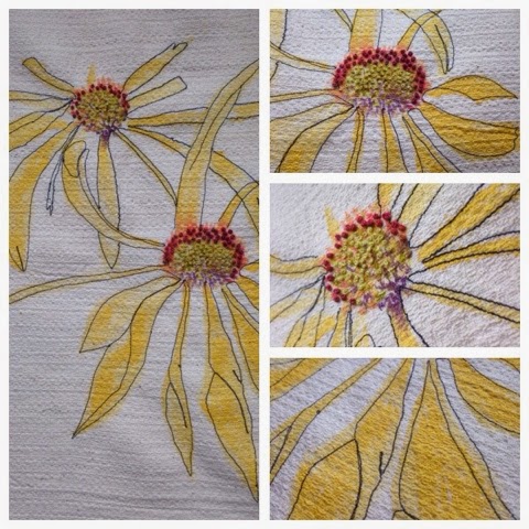
My friend Viv loves growing flowers but her self-confessed obsession is sunflowers.  So when it came to devising a workshop for our sewing group it seemed only natural to chose these cheery blooms as the subject. 

Viv wanted to take a non-traditional approach to stitching and so after a few sketches on paper we started to paint directly onto fabric.  I had taken some linen, silk dupion and a remnant that was possibly a wool/cotton mix.  The latter had an interesting surface texture and it held the paint without bleeding.  Rather than use sunflowers, I opted for a close relative, the rudbeckia.   I'd been given a card with a beautiful loose illustration and it was perfect for the task.

Once the paint had dried, I defined the petals with a single line of machine embroidery.  It seems more in keeping the original pen and ink drawing and I wanted to retain the fluidity of the original drawing by not following the painted outline too closely.  I worked French knots in lime green and verigated red embroidery cotton that provided just enough texture and sheen - beads would have been an over-kill given the simplicity of the work.

The colour detail in the centre of the flowers is what draws me.  I love the rich orange reds next to the zesty green and off-set by the deep purple at the core.

Friday 20 February 2015

In a twist


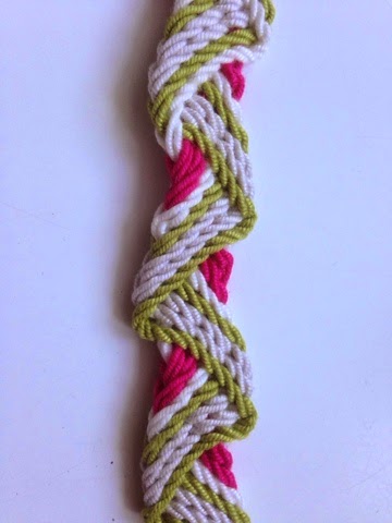
I tried my hand at ply-split braiding this week at a workshop led by Gail Marsh at Skipton Embroiderers' Guild.  It wasn't the easiest skill to learn, but the results are very satisfying.

What struck me about the workshop was the effort that Gail had out into preparing for the day.  Although there were over 20 of us taking part, Gail had made individual kits with 8 hand-plied cords in a beautiful selection of colours. Just looking around the room, I noticed that we had all selected a pack with our favourite colours.  Mine of course had a characteristic green theme  but the addition of white, soft-grey and bright pink give it a cheery spring vibe.  Gail's choice of colours was spot-on for the patterns we were braiding and making them into kits meant that no time was wasted deliberating over what colours to use.

My neighbour chose a the same colours for the wave-patterned bracelet in the picture but placed the plies in a different order.  The result was startlingly different.  Whereas mine appears to have a wave wrapped around a pink core, hers had strong borders of pink and green whilst the white and grey cords receded into the background.


Thursday 12 February 2015

Natural complements


I'm still pursing my theme of highlights and accent colours and this week it's a study of an old grey flagstone that was covered in the most magnificent orange lichens.  I found it whilst I was on holiday a couple of weeks ago and I was mesmerised by how the bold colours of the organic material transformed the austere tones of the rock.

I've done a quick sketch using simple biro cross-hatching and then added the accent colours with pigment ink pens.  The lichen covers a relatively small proportion of the rock but the orange really lifts the various shades of grey.

Tuesday 3 February 2015

Coral highlights


This week I have been experimenting with small amounts of colour to accentuate and draw attention to details.

The sampler in the picture was produced on a workshop with Hannah Lamb, working with found objects.   My collection of junk is part of my inheritance, a crazy number of small tins and boxes of sewing paraphernalia handed down to me from my Grandma and Mum.  Most of it has come in useful but one small tin contained many broken or odd items, why they had been kept is anyone's guess.  But in laying them out and anchoring them to the fabric with different stitches they somehow find new meaning.  Encouraged by Hannah's work, I chose a bright coral cotton pearle thread to highlight the curves and shapes of the safety pins, tacks and fixings.  I had some fun with the stitches: a fly stitch to anchor the zipper and herringbone to attach an odd paper-clip.


Hannah's technique provides a great way to display objects that have more sentimental than aesthetic value and the stitches are a fitting tribute to the sewing skills of my Mum and Grandma.

Monday 26 January 2015

January Blues


No chance of the January blues when these little beauties are there to greet me every morning! I love hyacinths but they don't like the heat and quickly bolt when kept indoors. I've discovered that the secret to keeping them strong, healthy and deliciously fragrant is a very cool, North-facing windowsill. 

Their colour is rather illusive; is it blue or purple? It's certainly off-set by the vibrant green leaves. The multiple flower heads on each stem lend themselves to a repeat process so I set about making potato prints. Using fabric paints, I mixed a deep turquoise blue with rich purple and a hint of sparkly pink for warmth.  Once I'd printed the flowers, I added some highlights of green/gold.  I printed onto thick hand-made paper. Now I can keep them all year round. 

Wednesday 14 January 2015

Winter Magic


In amongst the bare twigs of my winter garden, I notice that the witch hazel has performed it's magic.  Weird clusters of petals (I hardly dare call them flowers) appear on the branches and in the cold Northern light, they positively glow.

From a distance they look brown, but on closer inspection they have many hues: salmon pink, pale orange, rust and at their heart, a rich, deep, claret-red.  The petals of the flowers look crumpled and spidery and they cling to the branches in clusters, like loose pom-poms.

I use my pastel pencils to scratch out the twiggy outline of the bush and then choose a selection of colours over-layed to achieve the glow that I see in the flowers.  Like a good student, I have analysed the colour palette on the side.

Tuesday 6 January 2015

A Year in Colour


Inspired by a sumptuous book called Gypsy by Sibella Court and an equally lovely leather-bound journal that I received for Christmas, I have set myself the challenge of recording my year in colour.

Since it's both the Feast of Epiphany and the 12th day of Christmas it seems only fitting to start with gold: a candle burning bright, a smaller pot candle scented with orange and cinnamon, luscious clementines adorning my fruit bowl and a jar of precious spices from the Middle Eastern chef Ottolenghi.  These are my favourite things of the season: gifts given to me by friends and family, chosen with love and care.  Simple pleasures but worth their weight in gold.