My Mother's Day treat - afternoon tea prepared by my lovely girlies and served on a raspberry-spotted, china tea set handed down to me by my mother. What could be more special than that? Well maybe the raspberry and almond cake that's sat on it but that's another story!
Tuesday, 17 March 2015
Sunday, 8 March 2015
Red sky at night
I have to confess, I've never had any formal art training so when my local art group enlisted the services of tutor, Jane Austin, to teach a water colour class, I jumped at the chance! Jane works with a wet-on-wet technique. It's fast, it's bold and Jane likes to work on big pieces of paper so it was already ticking lots of boxes with me.
We worked from a photo of an evening sunset. Your eye is drawn to the brilliant colours in the clouds, but it is the dark formations in the foreground that provide all the drama. These were achieved by mixing deep blues and alizarine crimson with small amounts of red and yellow. As the paint dries and the paper soaks up the colours, subtle variations appear which add to the depth and complexity of the subject.
The effect reminded me of my Wall to Wall series of hangings: the hand mixed dyes were taken up by different fabrics giving variations of colour and the discharge dye bleaching process revealed hidden layers.
My first attempts at this water colour technique were a bit hit and miss but I can see the potential and it has reawakened my love of hand dyes fabrics.
Saturday, 28 February 2015
Painted sunshine
My friend Viv loves growing flowers but her self-confessed obsession is sunflowers. So when it came to devising a workshop for our sewing group it seemed only natural to chose these cheery blooms as the subject.
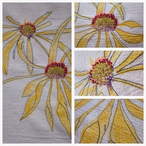
Viv wanted to take a non-traditional approach to stitching and so after a few sketches on paper we started to paint directly onto fabric. I had taken some linen, silk dupion and a remnant that was possibly a wool/cotton mix. The latter had an interesting surface texture and it held the paint without bleeding. Rather than use sunflowers, I opted for a close relative, the rudbeckia. I'd been given a card with a beautiful loose illustration and it was perfect for the task.
Once the paint had dried, I defined the petals with a single line of machine embroidery. It seems more in keeping the original pen and ink drawing and I wanted to retain the fluidity of the original drawing by not following the painted outline too closely. I worked French knots in lime green and verigated red embroidery cotton that provided just enough texture and sheen - beads would have been an over-kill given the simplicity of the work.
The colour detail in the centre of the flowers is what draws me. I love the rich orange reds next to the zesty green and off-set by the deep purple at the core.
Friday, 20 February 2015
In a twist
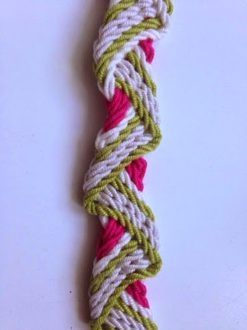
I tried my hand at ply-split braiding this week at a workshop led by Gail Marsh at Skipton Embroiderers' Guild. It wasn't the easiest skill to learn, but the results are very satisfying.
What struck me about the workshop was the effort that Gail had out into preparing for the day. Although there were over 20 of us taking part, Gail had made individual kits with 8 hand-plied cords in a beautiful selection of colours. Just looking around the room, I noticed that we had all selected a pack with our favourite colours. Mine of course had a characteristic green theme but the addition of white, soft-grey and bright pink give it a cheery spring vibe. Gail's choice of colours was spot-on for the patterns we were braiding and making them into kits meant that no time was wasted deliberating over what colours to use.
My neighbour chose a the same colours for the wave-patterned bracelet in the picture but placed the plies in a different order. The result was startlingly different. Whereas mine appears to have a wave wrapped around a pink core, hers had strong borders of pink and green whilst the white and grey cords receded into the background.
Thursday, 12 February 2015
Natural complements
I'm still pursing my theme of highlights and accent colours and this week it's a study of an old grey flagstone that was covered in the most magnificent orange lichens. I found it whilst I was on holiday a couple of weeks ago and I was mesmerised by how the bold colours of the organic material transformed the austere tones of the rock.
I've done a quick sketch using simple biro cross-hatching and then added the accent colours with pigment ink pens. The lichen covers a relatively small proportion of the rock but the orange really lifts the various shades of grey.
Tuesday, 3 February 2015
Coral highlights
This week I have been experimenting with small amounts of colour to accentuate and draw attention to details.
The sampler in the picture was produced on a workshop with Hannah Lamb, working with found objects. My collection of junk is part of my inheritance, a crazy number of small tins and boxes of sewing paraphernalia handed down to me from my Grandma and Mum. Most of it has come in useful but one small tin contained many broken or odd items, why they had been kept is anyone's guess. But in laying them out and anchoring them to the fabric with different stitches they somehow find new meaning. Encouraged by Hannah's work, I chose a bright coral cotton pearle thread to highlight the curves and shapes of the safety pins, tacks and fixings. I had some fun with the stitches: a fly stitch to anchor the zipper and herringbone to attach an odd paper-clip.
Hannah's technique provides a great way to display objects that have more sentimental than aesthetic value and the stitches are a fitting tribute to the sewing skills of my Mum and Grandma.
Monday, 26 January 2015
January Blues
No chance of the January blues when these little beauties are there to greet me every morning! I love hyacinths but they don't like the heat and quickly bolt when kept indoors. I've discovered that the secret to keeping them strong, healthy and deliciously fragrant is a very cool, North-facing windowsill.
Their colour is rather illusive; is it blue or purple? It's certainly off-set by the vibrant green leaves. The multiple flower heads on each stem lend themselves to a repeat process so I set about making potato prints. Using fabric paints, I mixed a deep turquoise blue with rich purple and a hint of sparkly pink for warmth. Once I'd printed the flowers, I added some highlights of green/gold. I printed onto thick hand-made paper. Now I can keep them all year round.
Subscribe to:
Posts (Atom)